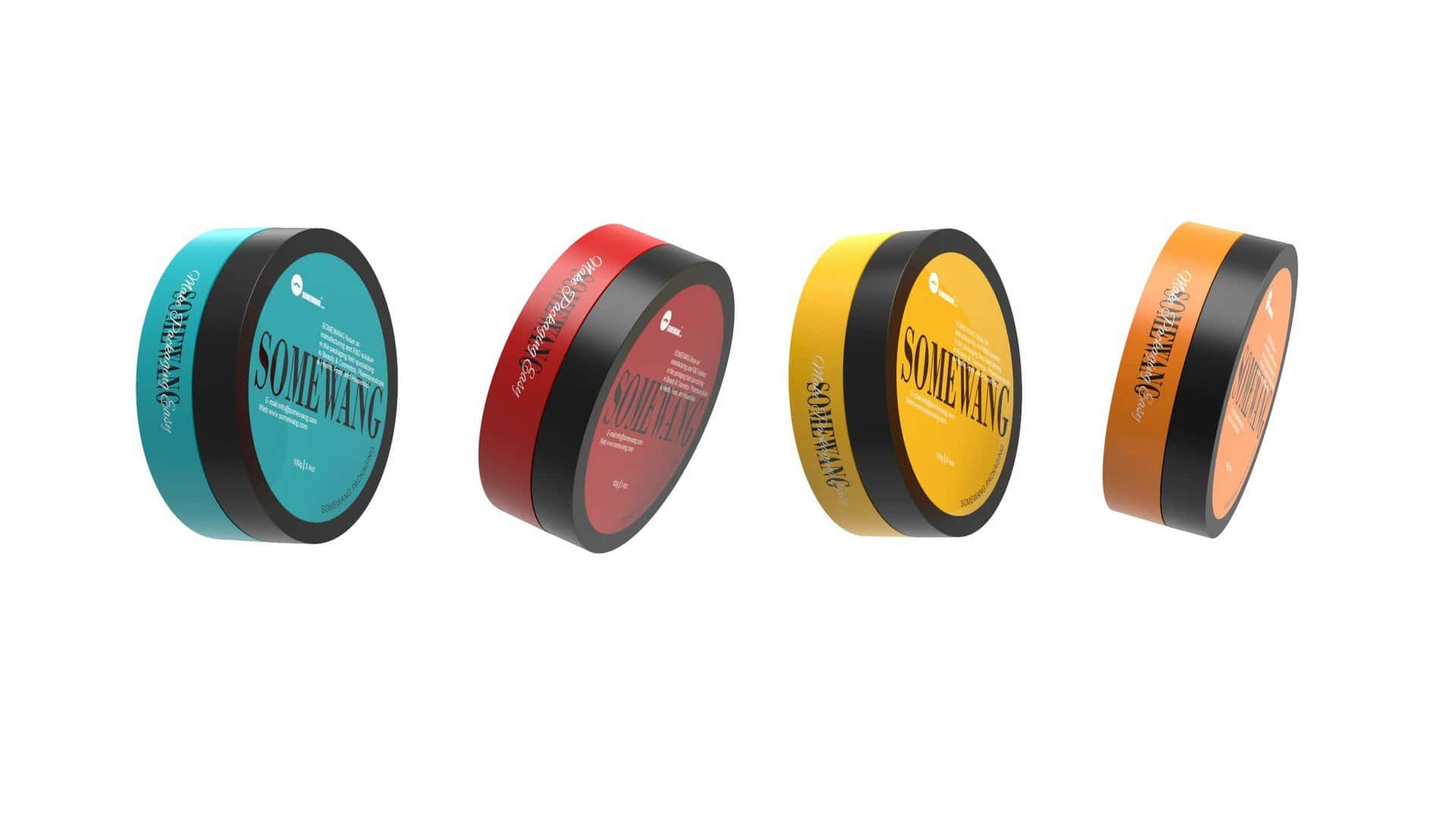
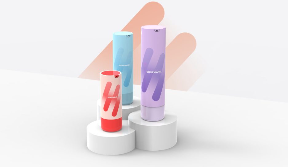
As a characteristic element of product nature, color is a direct reflection of beauty, and it is easy to cause people’s emotional reactions and changes. Therefore, in the packaging design, the color arrangement design should be referenced. People classify colors as warm and cool. Warm colors are mainly pink, orange, and red, which will give people a sense of warmth; correspondingly, cool colors are mainly blue, green, and gray, which are easy to make people feel quiet. psychological feelings.

In the process of color design of cosmetic packaging, designers can also use different forms of color matching, such as color contrast, continuous color, theme color, etc. Among them, color contrast refers to the choice of two colors with a strong contrasting effect in the packaging design, which can be warm to cool or dark to bright. This sharp color contrast can highlight the main elements of the design, thereby making the entire package more vibrant and dynamic, attracting consumers’ attention.
The use of color in cosmetic packaging should be considered from the following two aspects: First, from the perspective of color contrast. In cosmetic packaging design, contrasting colors can express the appropriate image. The contrast is mainly carried out from three aspects: the purity contrast can enhance the richness; the brightness contrast can enhance the bright feeling; the color contrast, including the complementary color contrast, the adjacent color contrast and the cold and warm contrast. When designing the color of cosmetic packaging, if you want to achieve the effect of being flashy but not flashy, you should make the contrast just right.

Secondly, analyze from the level of color tone. In cosmetic packaging design, hue is the main color of a group of colors that dominate the picture. The person who sells the product determines the color of the cosmetic packaging. Feminine products generally use noble, warm and elegant tones.
Due to the huge differences between consumers, cosmetic packaging must meet the aesthetic requirements of different consumers, so there are also differences in the requirements of cosmetic packaging.
People in different age groups perceive color differently. With the increase of age, people’s love of color will change greatly. Research shows that as children grow into adults, their color preferences also change from warm to cool. Corresponding children’s skin care product packaging colors generally use warm colors such as red, yellow, orange, and green. And adult cosmetic packaging can break with tradition and use bold colors to keep up with trends.

Consumers of different genders have different emotions for different colors, and the outer packaging of the same skin care products of the same brand adopts different colors due to the different genders of consumers. For example, the outer packaging of a certain brand of men’s moisturizing cream is black, while the outer packaging of the brand’s women’s moisturizing cream is relatively elegant white.
Generally speaking, the outer packaging of men’s skin care products mostly use cool colors with higher purity, such as gray and black, while the packaging of women’s skin care products prefers warmer colors with lower purity, such as pink and white. Also, women are more susceptible to color, while men are more dominated by sexuality. Therefore, women’s cosmetic packaging should pay more attention to the use of color, and product packaging with suitable colors will have a stronger appeal to women, thereby stimulating their strong desire to buy.

Due to the differences in regional customs, people’s education level and religious beliefs, the connotations of color given by culture are not the same. When designing cosmetic product packaging, it is also necessary for designers to master ethnic color taboos.
Popular colors are a product of multiculturalism. As the times change, different colors can resonate with people’s physiology and psychology. Cosmetics packaging designers can also adjust colors according to seasonal changes and fashion trends. However, before designing the packaging, a full investigation must be carried out, and the color should not be adjusted indiscriminately. At the same time, the sensitivity of consumers in the sales area must be considered, so that the designed color can effectively attract local consumers.
Color can be more easily perceived by people because of its uniqueness, and people can feel the artistic beauty contained in the design through color. In packaging design, the use of color has always been a problem that designers must fully consider. It not only needs to study people’s aesthetic laws of color, but also should fully consider the consumer, age, gender and current fashion colors of cosmetics, etc., in order to accurately grasp the scale of color visual aesthetics, so that the design characteristics of cosmetic packaging are more distinctive.

Somewang is looking forward to colliding with you in different colors to make the packaging more eye-catching.
Welcome to discuss more with Somewang!
Email: [email protected]
