
What are the Principles of Packaging and Labelling Design
Packaging and labelling work together to protect products, communicate brand values, and influence buying decisions.
Role in Brand Identity and Marketing
Packaging and labelling serve as the first physical touchpoint between a brand and its customers.
They communicate what a company stands for through colors, logos, typography, and imagery.
When someone picks up a product, the design instantly tells them whether it matches their values and needs.
Strong packaging design creates recognition across all products in a brand’s lineup.
Consistent use of brand elements helps customers spot familiar products quickly in crowded stores.
This visual consistency builds trust and makes shopping easier.
The marketing power of packaging extends is exactly beyond the shelf.
Products that look appealing often get shared on social media and become conversation starters.
Good design turns every package into a mini advertisement that reaches new potential customers.
Fundamental Differences Between Packaging and Labelling
Packaging refers to the physical container or wrapper that holds and protects a product.
It includes the material, shape, structure, and overall look of the box, bottle, bag, or container.
Labelling focuses on the information displayed on or attached to the package.
Labels show brand names, product details, ingredients, instructions, and required legal information.
| Aspect | Packaging | Labelling |
|---|---|---|
| Primary Focus | Physical protection and structure | Information and communication |
| Key Elements | Material, shape, size, opening mechanism | Text, graphics, symbols, compliance data |
| Main Purpose | Contains and preserves the product | Informs and educates the customer |
Both elements must work together seamlessly.
The packaging provides the canvas while the labelling delivers the message.
Key Elements of Effective Design
Clarity and simplicity form the foundation of good packaging and labelling design.
Customers should understand what the product is and why they need it within seconds.
Clean layouts with easy-to-read text help people make quick decisions.
Visual hierarchy guides the eye to the most important information first.
Brand names and key benefits typically appear largest, followed by supporting details.
Strategic use of bold text, color contrast, and spacing creates this flow naturally.
Functionality matters just as much as appearance.
Packages need to protect contents during shipping and storage.
Labels must stay attached and readable throughout the product’s lifecycle.
Beautiful design fails if it doesn’t work in the real world.
Principles of Label Design
Strong label design relies on three key areas: making information easy to find and read, connecting the label to the brand’s overall look, and picking the right physical format for the product.
Visual Hierarchy and Readability
The product name typically sits at the top of this hierarchy, using the largest and boldest text.
Next comes key details like flavor, size, or main benefits.
Legal information and ingredients appear last in the smallest text.
Readability depends on several factors.
Font choice matters—sans-serif fonts like Arial or Helvetica work well for small text, while decorative fonts can add personality to brand names.
The contrast between text and background needs to be strong enough for easy reading from a distance.
White text on dark backgrounds or black text on light backgrounds usually works best.
Product labels should maintain enough white space around text and images.
Crowded labels confuse shoppers and hide important information.
Each element needs room to breathe.
Testing readability means viewing the label from different distances.
If someone can’t read the product name from three feet away, the design needs adjustment.
Integrating Brand Elements
Brand identity shows up through colors, logos, fonts, and design styles.
These elements should appear consistently across all custom labels to build brand recognition.
When customers see the same color scheme or logo style repeated, they learn to spot the brand quickly on store shelves.
Colors carry meaning and emotion.
A natural food brand might use green and brown tones to suggest freshness and earth.
A luxury product might choose black and gold for elegance.
The colors on product labeling should match colors used in ads, websites, and other brand materials.
Logo placement needs careful thought.
The logo should be visible but not overpower the product name or key details.
Many brand labels place logos in the top corner or center of the design.
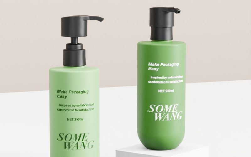
Typography creates personality.
A playful brand might use rounded, friendly fonts.
A serious brand might choose sharp, clean lines.
Whatever fonts appear on the label should match fonts used elsewhere in the brand.
Selecting Label Shapes and Sizes
Label shape and size depend on the product container and the amount of information needed.
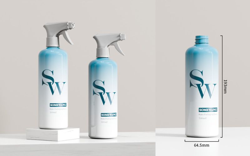
Round labels suit jars and bottles.
Rectangular labels work well for boxes and flat surfaces.
Custom labels can take unique shapes to stand out, like oval labels for specialty foods or die-cut labels that follow a logo’s outline.
Size considerations start with the container dimensions.
Labels should cover enough area to display required information without overwhelming the package.
A small bottle needs a proportionally smaller label that doesn’t wrap around multiple times.
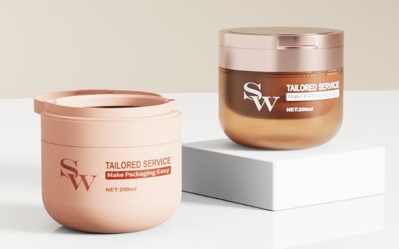
Material choice affects durability and appearance.
Waterproof labels protect products in refrigerators or ice buckets.
Matte finishes give a natural, understated look.
Glossy finishes make colors pop and suggest premium quality.
Shape and size also impact production costs.
Standard shapes cost less to produce than custom die-cuts.
Larger labels use more material and increase expenses.
Special Considerations for Cosmetic Labeling
Product labels must meet specific legal standards while clearly communicating essential information to consumers.
Unlike other product categories, cosmetics are applied to the body and often contain active or potentially sensitive ingredients, making labeling rules strict and consumer trust dependent on clear, accurate information. Below are the key special considerations for cosmetic labeling, organized by priority:
Regulatory Compliance
Every region has strict laws governing cosmetic labeling to protect consumers from misinformation, harm, or fraud. Compliance is non-negotiable—failure can result in fines, product recalls, or bans. Key regional regulations and universal requirements include:
| Region/Regulation | Core Labeling Mandates |
|---|---|
| EU (Regulation (EC) No 1223/2009) | – Ingredient list: Mandatory “INCI names” (International Nomenclature of Cosmetic Ingredients) in descending order of weight (for ingredients >1%); <1% can be listed in any order after the “1% line” (marked with “*” or “<1%”). – Product function: Clear statement of use (e.g., “moisturizing face cream,” “volumizing shampoo”). – Warning labels: For hazards (e.g., “Avoid contact with eyes,” “Keep out of reach of children”). – Batch/lot number: Traceable code for recalls. – Expiry date: “Best before end” (BBE) for products with <3-year shelf life; “Period After Opening” (PAO) symbol (e.g., “12M”) for products that degrade after opening. |
| US (FDA Cosmetic Labeling Requirements) | – Principal Display Panel (PDP): Product name, net quantity of contents (e.g., “50 mL”), and “identity statement” (what the product is). – Information Panel (IP): Ingredients (common names allowed, but INCI preferred for clarity), manufacturer/distributor contact, warning labels (e.g., “For external use only”). – No mandatory PAO, but highly recommended for consumer safety. |
| China (GB 5296.3-2008) | – Mandatory Chinese and English (if exported) labeling. – Ingredients (INCI + Chinese names), product function, batch number, expiry date, and manufacturer license number. – Warnings for sensitive skin (e.g., “Patch test recommended”). |
Ingredient Transparency
Modern consumers prioritize “clean beauty,” “vegan,” “cruelty-free,” or “hypoallergenic” claims—and they expect labeling to back these up. Key considerations:
- Accurate “Free-From” Claims: If labeling “paraben-free” or “sulfate-free,” ensure ingredients like methylparaben or sodium lauryl sulfate are not present. Regulators penalize “greenwashing” .
- Allergen Disclosure: Highlight common allergens prominently—even if they’re in small quantities.
- Active Ingredient Clarity: For products with functional claims, list active ingredients and their concentrations.
Safety Warnings
Cosmetics pose unique safety risks, so labeling must guide safe use:
-
- “For external use only”.
- “Avoid contact with eyes.”
- “Keep out of reach of children”.
Frequently Asked Questions
What are the essential elements I should include on my product label for clarity and compliance?
Every product label must include the product name, brand name, and net quantity or weight.
How can I make my packaging more eco-friendly without compromising on design quality?
Recyclable materials like paper, cardboard, and certain plastics reduce environmental impact.
What are the latest trends in packaging that can help my product stand out on the shelves?
Minimalist designs with clean lines and simple typography create a premium look.
Bold, oversized text draws attention from across the aisle.
Unusual shapes and structures break away from standard rectangular boxes.
Transparent or windowed packaging lets customers see the actual product inside.
This approach builds trust and works especially well for cosmetic items.
Are there certain color schemes that are more effective for product packaging to attract customers?
Bright, bold colors grab attention in crowded retail environments.
Red stimulates appetite and creates urgency, making it popular for food products.
Blue suggests trust and reliability, which works well for health and technology items.
Green connects with natural and organic products.
Black and metallic tones communicate luxury and premium quality.