The same is the application of color design, and someone is playing with color very well. For example, Camilo Ciprian, a 3D artist from Colombia, is very good at color-matching. The cans he designed use Pantone’s colors of the year in recent years. The color scheme is very good, the lineup is strong, and the color matching is amazing and touching. This time is not only to see, remember by the way to master the color matching also learn to walk, flair!
Bright yellow & Extreme gray
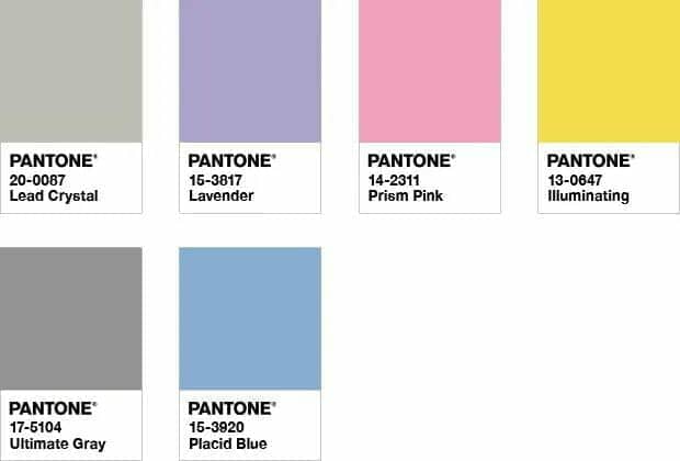
The annual color of Pantone in 2021 is a bright yellow & extreme gray, color numbers: 13-0647 and 17-5104. As for the meaning of the annual color of bright yellow + extreme gray, the official statement is: “durable extreme gray and vivid bright yellow combine to express a tough positive attitude. This color combination is practical and stable, but also warm and optimistic, bringing resilience and hope to us. We need to feel inspired and uplifted. It’s an essential part of the human psyche.” In the creation of master Camilo Ciprian, in addition to the application of the annual color bright yellow and extreme gray, the appropriate addition of white, suddenly feel more simple and elegant?

About how to use the pantone color 2021 officials also gives the color combination.
Classic blue
The 2020 Pantone Color of the Year is Classic Blue, color number: 19-4052. As for the meaning of Classic Blue, the official statement is as follows: “Classic blue is associated with a calming color that brings peace and serenity to the human mind and provides shelter. It is a color that AIDS concentration and clarity and allows us to refocus our thoughts. It is a thought-provoking blue that breeds resilience.” In Camilo Ciprian’s creation, the color of the year is paired with light blue and light beige to give the work a more dynamic look.
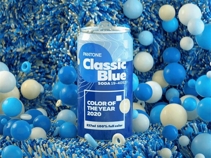
About how to use the pantone color 2020 officials also gives the colour combination tie-in proposal.

Coral orange
Pantone Color of the Year 2019 – Coral Orange, Colour No. : 16-1546. The official statement on the meaning of Coral Orange of the Year reads: “Color is a balanced lens through which we experience both nature and digital reality, especially Coral Orange. “Consumers crave human-computer interaction and social connections, and the cheerful Coral offers a human and uplifting quality that touches people’s hearts.” Camilo Ciprian’s colors of the year are paired with light blues and greys to create an instant sensation of looking at coral in an underwater world.
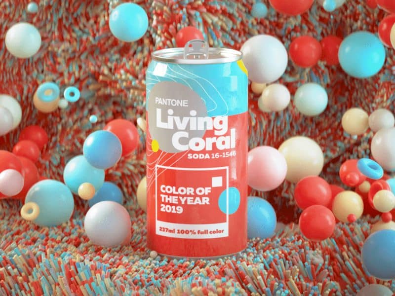
About how to use the pantone color 2019 officials also gives the color combination.

Ultraviolet light color
PANTONE 2018 annual a coral orange color, the color no. 18-3838, about the moral of ultraviolet light color annual color, the official says: “uv creative and imagination! It lit up the path to the future! A strong stirring up thoughts and reflections of purple tones convey originality, creativity and forward-looking thinking, as we point to the future “. The creation of the master in Camilo Ciprian, annual color collocation bright yellow and light purple, looks very unique and bright eye.
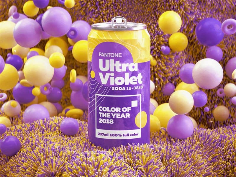
The official Pantone Color of the Year 2018 offers advice on how to use these color combinations.

Greenery
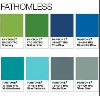
PANTONE 2017 annual a grass green color, the color no. : 15-0343, about the meaning of annual grass green color, the official says: “pure and fresh and vitality of the color, grass green is the symbol of the newborn. Grass is a representative early spring season all things recovery, vibrant color, as in the lush green plant, let a person can’t help began to take a deep breath and feel the fresh air, the spirits “. The creation of the master in Camilo Ciprian, annual blue and white color collocation, more reveal a vibrant picture.

The official Pantone Color of the Year 2017 offers advice on how to use these color combinations.
Rose Quartz Pink & Serenity Blue
2016 Pantone Color of the Year: Rose-Quartz Pink and Serenity Blue, Colors Nos. 13-1520 and 15-3919. The official statement about the meaning of Rose-Quartz Pink and Serenity Blue is: “As consumers pursue mindfulness and happiness as an antidote to the stresses of modern life, a friendly color that psychologically satisfies a desire for reassurance and security is becoming ever more important. The combination of rose quartz pink and serenity pink blue reveals an inherent balance between warm and intimate rose tones and calm and serene blue, reflecting connection, happiness, and a soothing sense of order and peace. In the creation of Camilo Ciprian, the color of the year is paired with white, which gives the work a sense of softness and fusion. The visual effect is really great.

The official Pantone Color of the Year for 2016 offers advice on how to use these color combinations.

Marsala red
2015 Pantone color of the year: Marsala, color number: 18-1438, about the meaning of the color of the year of Marsala, the official statement is: “a natural strong and simple wine red. Marsala red enriches our spirit, body and soul. Its name comes from the fortified wine of Marsala. The flavorful hue is as the name suggests, reflecting the richness of a well-rounded meal, while its red and brown undertones exude a natural, ripe, earthy feeling. This warm and stylish color has universal appeal and can be easily applied to clothing, beauty, industrial design, furniture and upholstery. In Camilo Ciprian’s work, the color of the year is paired with light beige and yellow.
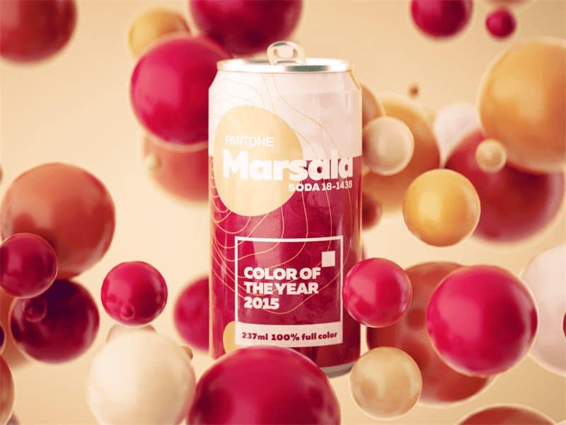
About how to use the pantone color 2015 officials also gives the color combination.

Bright purple orchids
PANTONE 2014 annual colour is a purple orchid, bright color number: 183224, about the moral of annual color bright purple orchid, the official says: “bright purple orchids bloomed in confidence and warm, it can attract attention, stimulate the imagination. This is a purple, make people fascinated with attractive glamour attracted you near. Bright purple orchid is purple, purple and pink color for fusion of the charming color, arouse the self-confidence, send out a great joy, love and health “. The creation of the master in Camilo Ciprian, annual mei red color collocation, much a soft touch.
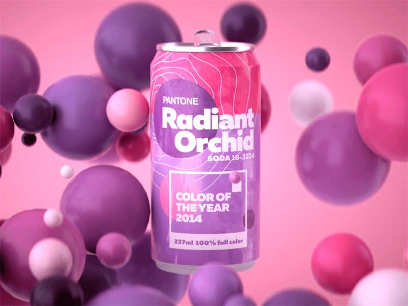
How to use the Pantone Color of the Year for 2014· Suggestions for color matching.

Emerald green
The Pantone Color of the Year 2013 is emerald green, color number 17-5641. “The most abundant color seen by the human eye in nature is green, which is more complex than any other color. Throughout history, the multifaceted emeralds have glistened with fascination. Symbolically, jadeite brings a sense of clarity, renewal and renewal. This powerful and universally appealing colour palette can be easily translated into fashion, home decor and textiles.” In master Camilo Ciprian’s work, the color of the year is paired with yellow, and the spirit of the picture rises.
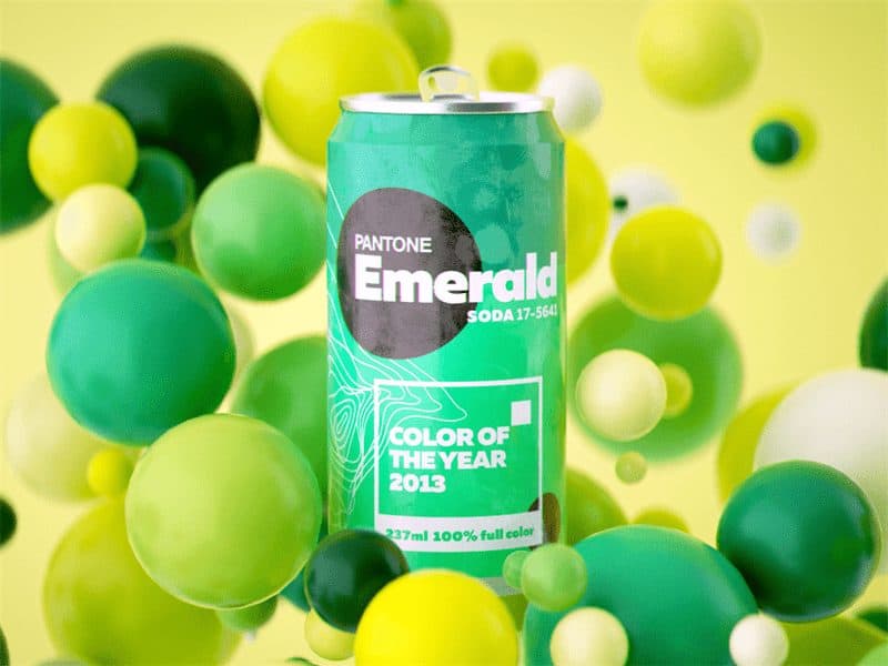
The official Pantone Color of the Year 2013 offers advice on how to use these color combinations.

Mining’s orange
PANTONE 2012 annual a tango orange color, the color no. 17-1463, about the moral of tango annual orange color, the official says: “tango orange delicate, and absorbing, and full of depth at the same time. Tango radial orange reminiscent of sunset shadow, lively red and yellow friendly and warm together, formed the high visibility of magnetic tonal, gives off heat and energy.” The creation of the master in Camilo Ciprian, annual green blue color collocation, visual effect is very good.

HoneysuckleIn
2011 annual color PANTONE a honeysuckle, color number: 18-2120, about the moral of honeysuckle annual color, the official says: “in times of stress we need something refreshing. Honeysuckle is a fascinating excitant color, can stimulate the adrenaline, is the perfect choice for protection against the blues. Its positive qualities from its parent color red, this is the most physical spectrum, the inherent lively tonal. And because of its relevant can delicious aroma reminiscent of spring and summer one day.” The creation of the master in Camilo ciprian, annual bright yellow color collocation, visual impact is very strong, can let a person instant perception of its existence.

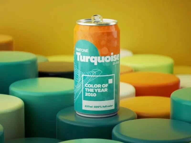
Turquoise
PANTONE 2010 annual a turquoise color, the color no. : 15-5519, on the moral of annual turquoise color, the official says: “in many cultures, turquoise is considered to be a protective talisman is affectionate and very cure people of color, it is inspired by the water and sky the color of the faith and truth. Through the color word association studies for many years, colour the team also found that for many people, turquoise on behalf of escape, that they may enter a pleasant and attractive tropical paradise, even if it is just a fantasy. At the same time it has general commonness, for men and women are attractive, and can be easily converted to fashion and interior “. The creation of the master Camilo Ciprian, annual orange color collocation, although no visual impact, but the numerous items, contracted and unique design style can still stand out.
Behind the popular annual color, under the industry to promote the change of generation and the reaction of the new consumption trend. Consumers of this age, had less strict measure daily shopping value according to the function of the item, but as a form of self-expression, eager to establish emotional connection with the product, and color is this open consumer invisible key of soul. 3 d art master CamiloCiprian is to cater to the PANTONE in recent years the annual trend of color design different works, he looked at more use of good-looking color scheme can soothe the mind!
